4-5 : Web Buttons and RolloversIntroduction
Where to begin? If you are creating several buttons that will go on the same page, start your design with the button that has most text. This ensures that all of your other text labels will fit. We start by opening a new window in PS. You should now how to do this right? File > New (CTRL+N) to open a "New" dialog window. 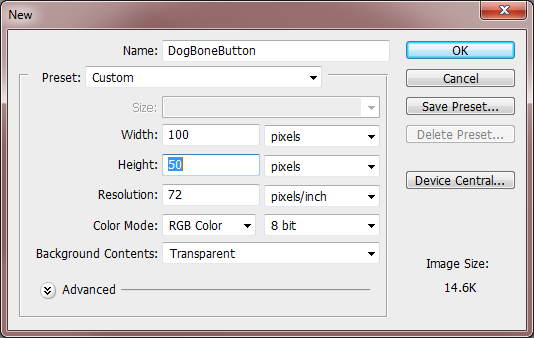
Here I have given it a name of 'DogBoneButton' and set the Width to be '100 pixels' and the Height to be '50 pixels'. I used pixels because this is for the web and it understands pixels, not inches or points, etc. (Also, you can make buttons any size) The Resolution is set for '72 pixels'. The Color Mode is an '8 bit RGB'. (Because the web likes that too) I also selected a 'Transparent' background because I don't want to have color behind it (this will let the background show). So now we have a new window to work in (it's small so you might want to 'Zoom' into the workspace). We'll need to find clipart of a bone or draw one... Let's draw one! 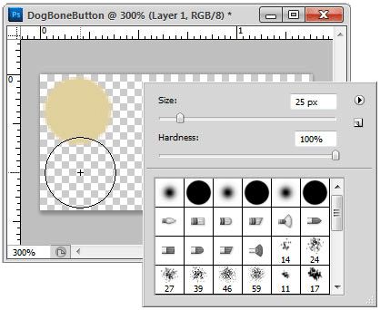
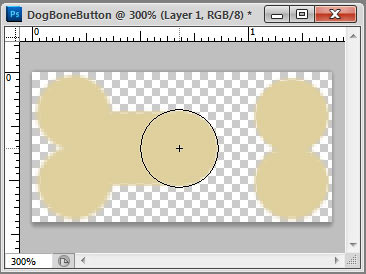
Place the curser in the upper left corner and 'Click', move the curser down and click again (hold the shift key to keep it straight ) and repeat this in all four corners (if you can't see your new curser size, you have your 'Caps Lock' on and/or you need to change your 'Preferences' by navigating to Edit > Preference > Curser to 'Normal or Full Size Brush Tip' in the 'Options Box'). Now we connect the two ends with a line of the same width, starting at about midway of the circles, 'Shift+ Left Click and Drag' across to the other side. Release the mouse button when you get to the other side. (Holding down the 'Shift Key while dragging' constrains the line straight) Wow, wasn't that the quickest and possibly the only dog bone that you have ever drawn! This will be the base with a transparent background, that we will use for our button.
Photoshop has at least 3 ways to do anything... with that in mind,
There are more: see what ways you can find on your own 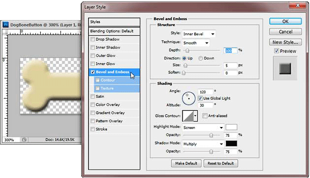
Next we will add some highlights and shadows to it using the 'Blending Options' (2-2) to add 'Bevel and Emboss' properties to it. I'm just using the defaults for the 'Inner Bevel' in the screen shot above but you can change these to anything that you want, after you have set your values, click 'OK' to apply them. Remember that you can always turn these off or change these by adjusting them from the same window. This the 'UP' state of your button. Add text to it by selecting the 'Text Tool' (1-12) and 'Clicking' somewhere in the middle of the bone. You're going to want to change the color of your text so you can see it... I chose red because there is red in the logo and I titled this button 'HOME'. You'll want to double check that you center the text. I used an '18 point' font though you can use anything you like and the size will depend on the font that you pick, I used 'Narbonne'. Whatever the font you use, make sure that it is easy to read when it's at 100%. Think Bold not Thin and if you are using a particular font in your overall design, you should use something that goes with that. 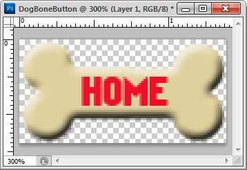
The word 'HOME' looks too flat, so let's do the same exact thing we just did and add a bevel to it. Though, this time will change the 'Angle' of the light to '-60'. Make sure to uncheck the 'Use Global Light' so you don't change the angle of the bone shading and use the 'Emboss' option so it looks recessed. You will also have to reduce the 'Size' to a pixel or two. 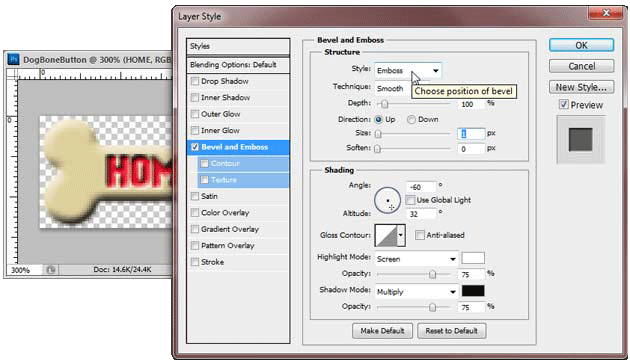
We need a copy of this group so that we can make the "DOWN State" of the home button. Grab the main group layer, 'Click+ Drag+ Release' over the copy icon on the bottom of the 'Layers Palette'. A new group called "Home UP copy" will be listed, we will change this to be called "Home DOWN" by 'Double clicking' on the text. The new layer groups is identical to the original, same 'fx', same placement, etc. All we want to do here is to 'Double Click' on the 'fx' icon and open the 'Blending Options' window so that we can change the 'Angle' of the light by '180 degrees' or so for both layers of the new group. SO, with all that done, we need to save them out individually, 'Click' on the 'Eye' icon for the 'Home DOWN' group layer to turn the 'Visibility OFF'. Navigate to File>Save for Web and Devices... (Alt+Shift+Ctrl+S) and save is as a 'GIF' with a transparent background (Because we don't want to see a background color). Name the file 'Home UP'... Now do the same thing for the other button, turn 'OFF' the visibility for the 'Home UP' group layer and turn 'ON' the visibility for the 'Home DOWN' group layer, save it, and name it 'Home DOWN'. You now have two GIF's to use as a rollover button.
Conclusion Web buttons should have a small file size so that they load fast. They also need to be easily read and easy to find on your webpage. Create a new button using any shape and text that you like. If you have a web site authoring program, post it and try it out. If you don't - e-mail it to us, and we'll post it for you so that you can see how it works. Reference
|
|||||||||||||||
<< Previous Tutorial |
Return to List |
Next Tutorial >> |
|||||||||||||

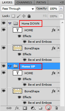 You are now finished with the 'UP State' of you home button. Let's make the 'DOWN State' of your button now. For Neatness' sake and to make your life easier when you make 10 more of these little buttons, we are going to put these two layers into their own group (
Owned and operated by The Art Department, Chester, NE |
Last Update: |